Color Combo; 10 of 10: Elizabeth

We are going crazy with delight over color combinations.  From simple to dramatic, from bright to light, the hues are sure to tickle your rainbow.


This is what I call my "ooh la la" color combination.  

I love the look of pink, rich red and crisp black together.  To soften the overall design, I decided to create the sentiment elements in a dark grey.  This allowed the bold border edges to stand out as well as not deter from the focal element of the vintage bird cage.

By paper piecing the die cut birdcage with two colors, the element remained delicate yet colorful.  

Tip:  To give die cuts subtle dimension without losing their delicate design and becoming bulky, use two different thicknesses of paper for the color piecing.

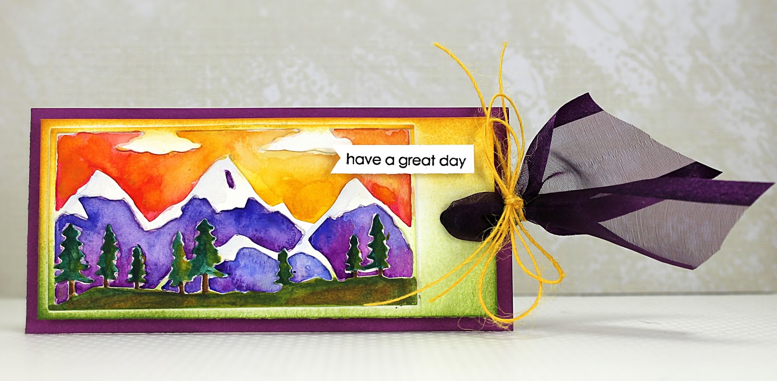
All the colorful details, Penny Black products, instructions and supplies can be found in this project guide HERE.

We hope you have enjoyed our color combo event and have found some ideas that tickle your rainbow.


Color Combo; 9 of 10: Jill

We are going crazy with delight over color combinations.  From simple to dramatic, from bright to light, the hues are sure to tickle your rainbow.


I hope you don't mind... I'm back AGAIN with my new favorite die cutting/watercolor technique (detailed directions available on 6/29 post).  Today I've tried it with Penny Black's Creative Die 51-145 feLINE. 


I love the combination of the primary red, blue, green, and yellow colors with the neutral colors of the kitties. 

All stamps and dies by Penny Black: 51-145 Feline, 51-050 Tweet Things, 30-283 Snippets

Color Combo; 8 of 10: Elizabeth

We are going crazy with delight over color combinations.  From simple to dramatic, from bright to light, the hues are sure to tickle your rainbow.


Sometimes the trick to using a specific color combination is in the "quantity" of the colors.

In this design, you can see that I used mostly blue with small touches of brown and tan and lastly a splash of red/orange.

Designer paper is an easy way to coordinate with your color combo and add a subtle pattern.  This blue and white hexagon paper was a perfect match to the colored image while also adding a sense of movement in the window. 

Want to send a gift of a smile too?  
Click HERE for a complete project guide that lists all the gorgeous Penny Black stamps and designer papers used in this design as well as instructions and other products.


Color Combo; 7 of 10: Jill

We are going crazy with delight over color combinations.  From simple to dramatic, from bright to light, the hues are sure to tickle your rainbow.


My favorite thing about this next color combo? The unexpected dark blue accents!

Again, this card was created using the same techniques as my tag shown on 6/29 (for detailed directions, scroll down to that post).  I hope your garden view looks as beautiful as this...how I wish I had a green thumb! (The only time my thumb is green is if it is covered in green paint or stamping ink. LOL)

All stamps and dies by Penny Black: 51-144 In the Garden, 2025M Music Note Background


Color Combo; 6 of 10: Elizabeth

We are going crazy with delight over color combinations.  From simple to dramatic, from bright to light, the hues are sure to tickle your rainbow.


This trio of colors is one of my favorites!

I find using softer shades of a given color combination adds to the depth of the card and also allows you to use the stronger shades as focal points.  

Rich raspberry and orange colored in their strongest hues draw your eye directly to Mimi's outfit while the softer pink flowers and frame softly extend the design.

Tip:  Turning Penny Black's polaroid die cut on it's side makes a terrific frame.  It will add a little more "weight" on one side which is a nice offset to the open window.

To learn how to create this "cup of sweetness", click HERE for a project guide containing instructions and a complete supply list of all the Penny Black stamps, dies and patterned papers used.

Stay tuned....the colorful color combos continue at Studio Sessions!


Color Combo; 5 of 10: Jill

We are going crazy with delight over color combinations.  From simple to dramatic, from bright to light, the hues are sure to tickle your rainbow.


I think I was dreaming of a warm summer sky when I created this next tag...

This tag was created using the exact same techniques as my tag shown on 6/29 (for detailed directions, scroll down).  I guess I just can't get enough of this technique! LOL

All stamps and dies by Penny Black: 51-143 Mountains, 30-283 Snippets


Color Combo; 4 of 10: Elizabeth

We are going crazy with delight over color combinations.  From simple to dramatic, from bright to light, the hues are sure to tickle your rainbow.


If you think a four-color combination might be intimidating, try using one of the colors as a soft accent.  

Grey zigzags stenciled on the card base creates a subtle background for these framed flowers.  Nature gave me the inspiration for the pretty blooms.  A happy red tinted with a vibrant orange creates a strong focal point while the green stems coordinate with the banner accent.  

A pretty white die cut frame lends a touch of dimension.

All these beautiful stamps, dies, stencils and patterned papers are by Penny Black.

For a project guide containing complete supplies and instructions, click HERE